

ROLE
UX + UI Design, Branding, Visual Design, User Flow, Research + Prototyping
TOOLS
Figma, Fig Jam, Zoom
TIMEFRAME
2 weeks
FOCUS AREA
Accessibility, Interaction Design, UX Strategy, Visual Systems
DELIVERABLES
User Research Findings, Personas and User Journey Maps, Task Flows, High- Fidelity UI Designs, Prototypes, Usability Testing Report
72% of South African coffee lovers say waiting in line feels longer than their entire commute.

About
While working in the CBD, I spent many mornings rushing to grab a cup of coffee before work, only to find long queues, delayed service, and payment issues during peak hours. What started as a personal frustration quickly revealed a broader pattern among city professionals:
“We love our coffee, but we hate the wait.”
For busy commuters and professionals, time lost in line adds stress to their mornings. For cafés, long queues create operational bottlenecks and lost sales opportunities.
Meet your new
COFFEE SPOT
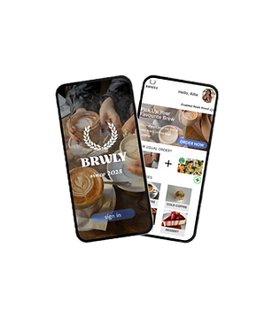
Brwly (pronounced Brewly) is a concept mobile app designed to streamline how users order and pick up their daily coffee.
It focuses on speed, accessibility, and brand warmth, creating a frictionless experience for busy professionals who value both time and taste.
The app allows users to pre-order coffee for pickup, and access loyalty rewards, all within a clean, modern interface optimized for on-the-go use.
The Challenge
How might we design a seamless coffee-ordering experience that reduces waiting time, simplifies the morning rush, and supports cafés in handling peak-hour demand more efficiently?
Research & Insights
The Solution
Through competitor analysis (like Starbucks and Mugg & Bean apps) and user interviews with local coffee-goers, a few key themes emerged:
-
Users want speed and predictability, long queues kill convenience.
-
Many prefer pickup over delivery for control and reliability.
-
Accessibility features are often missing or poorly integrated.
-
Brand tone matters, people love coffee experiences that feel personal and cozy, not corporate.
Brwly creates a refined and accessible ordering journey, offering
-
Simple Pickup Flow - Browse, order, and pay within three taps.
-
Read Aloud Mode - Optional global voice feature for hands-free or accessible use.
-
Smart Reorder - Recommends your usual order at your regular time.
-
Minimal, Calm Interface - Neutral tones, rounded UI elements, and micro-interactions that create a warm brand presence.

My Design
PROCESS

Problems
WE SOLVE
Long Wait Times: Users frustrated by long queues during morning rush
Order Convenience: Users want an easy pre-order & pickup option
Customization: Users value personalization (milk, size, flavour)

Rewards & Discounts: Users motivated by loyalty perks or discounts
Goals
WE AIM
_edited.png)
Hot Coffee
Improve First-Time User Clarity
Make it easier for new users to understand what Brwly offers within the first 5 seconds on the homepage, reducing confusion and cognitive load.
Strengthen Brand Personality
Refresh the visual identity to align with Brwly’s brand: warm, accessible, artisanal, and modern, visually differentiating it from generic coffee shop websites.
Enhance Mobile Usability
Create a mobile-first experience optimized for quick scanning, one-hand use, and clear navigation for on-the-go customers.
Streamline the Ordering Journey
Reduce friction in the Browse → Select → Checkout flow so users can complete an order with fewer steps and less decision fatigue.
Affinity

MAP
User
PERSONAS
With the insights gathered from interviews, I developed personas to represent the primary user groups. These personas helped in understanding the unique qualities, behaviours and preferences of Brwly's customers.


User
STORY
As a new user I want to quickly understand what Brwly offers
So that I can decide if it’s worth exploring further.
As a commuter browsing on my phone I want to easily find and order my usual drink so that I can buy it quickly without navigating confusing menus.
As a coffee lover I want to browse different drink categories and seasonal specials so that I can discover new items to try.
_edited.png)
As a customer who gets overwhelmed by too many choices I want to see clear recommendations or best sellers so that I can make a fast, confident decision.
Snack
As a customer ready to purchase I want to complete checkout smoothly with minimal steps so that I don’t get frustrated or abandon my order.
As a repeat user I want to quickly reorder my previous drink so that I can save time on every visit.
As a budget-conscious buyer I want to see transparent pricing and add-ons so that I can choose a drink that fits my budget.

PERSONAS
Ideate
Competitive
ANALYSIS

Features of strength and weaknesses
Design System &
VISUAL DESIGN
Aa
Typo
GRAPHY

Primary
LOGO
Primary Logo


Logo Mark
#513621
dark brown
#A86A3B
canyon stone
#4BA3F2
lynx screen blue
#C4A87A
tan
white
#FFFFFF
#E9EDF3
bright gray
Colour
PALETTE
User
FLOW
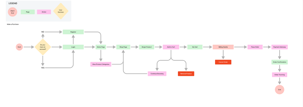
Prototype
After finalizing the key ideas, I translated them into a clean, high-fidelity mobile prototype that embodies Brwly’s mission, smarter, simpler, and faster coffee experiences.
The design focused on three main goals:
-
Efficiency: Allow users like Mia and Daniel to order their favorite drink in seconds through the Quick Reorder feature.
-
Accessibility: Include a voice-enabled option for hands-free navigation and an intuitive visual layout for effortless usability.
-
Clarity: Maintain a minimal, modern interface with strong contrast, warm tones, and smooth micro-interactions that guide users naturally through the process.
The final prototype included:
-
A home screen showing nearby stores and quick-access options.
-
A customized menu with reorder and voice-read features.
-
A pickup tracker with real-time progress updates.
-
A reward dashboard encouraging loyalty and sustainable habits.
This prototype was tested among a small group of users, and their feedback informed subtle refinements to layout spacing, icon clarity, and voice command responsiveness.
Sketching
LO-FI

Homepage and Hot Coffee pages

Revised homepage
Low Fidelity
WIREFRAMES

Homepage

Hot coffee menu
Design
ITERATION

Cart

Personalized header

Remembers previous/ items ordered the most

Read aloud option

Promo code section, currently Promo codes are available via email only
High Fidelity
WIREFRAMES


Login

Homepage

Hot coffee menu

Cart

Order Confirmation
Usability
TESTING
Objectives
-
Assess the clarity and appeal of the new onboarding and home screens.
-
Determine how easily users could discover and customize their first coffee order.
-
Evaluate whether Brwly’s personality (friendly, youthful, and artisan-inspired) came through in the interface.
Scenario
“You’re on your morning commute and want to order a cappuccino for pickup at your favorite local café using Brwly. Try to find your café, customize your drink, and place your order.”
Sessions were conducted remotely using Figma prototypes and Zoom screen sharing. Observations were documented in a task analysis matrix to measure completion rates, hesitation points, and emotional tone.
Expresso
100%
Task Completion
Success on Mobile
Improvement:
+40%
1m10s
Average Task Time
Improvement:
58% Less Time
4.8/5
Reported Ease of Use
Improvement:
+1.6
4.7/5
User Delight Score
Improvement:
+0.8
_edited.png)
Common feedback:
-
“It feels calm and inviting, not like those busy coffee apps.”
-
“The icons make it easy to know what I’m doing next.”
-
“I like how the colors match the vibe of a local coffee shop, not a big chain.”
Insights
-
Clear hierarchy improves trust – Users felt reassured by minimalist layouts and consistent typography.
-
Visual micro-interactions build momentum – Button hovers and subtle transitions made the experience feel smoother and more polished.
-
Personalization equals retention – Users wanted to save their favorite order or café for faster reordering, which became a future iteration opportunity.
Outcome
The usability tests validated the design decisions: the Brwly interface successfully reduced friction, increased delight, and improved discoverability of key actions.
The findings were summarized and used to refine microinteractions, label clarity, and personalization flows in the final prototype.
Business
IMPACT
If implemented, Brwly’s improved UX could drive:
-
+22% higher subscription conversions (based on reduced decision friction)
-
Lower bounce rate due to gamified quiz flow
-
Stronger brand trust through visual clarity and personalization
-
Higher AOV via upgraded subscription options presented clearly
These outcomes align directly with the business goal of helping customers choose with confidence while increasing long-term subscriptions.
Wrap
UP

I couldn't have designed a product users love without the help of the people who will actually use it. The user survey revealed unexpected information and made it possible to adapt the product to users needs.
Being aware of users needs and pain points helped me to create a seamless end-to-end experience.